River City Rentals - Logo and Branding
Out in the beautiful hills and valleys of Chattanooga Tennessee, my Client Bree came to me in need of a logo for her new business. Her and her business partner had a pretty strong idea of what they wanted, they even submitted a cute chicken scratch drawing. Even though they apologized for the napkin drawing it was totally enough to go off of and together we brought their vision to life!
Phase 1
My client started by sending me an idea of what they had in mind, below you will see the line drawings they submitted.
“Could we get something with the iconic mountain, rivers, bridges, and words.” - Matt (examples below)


Inspirational Imagery
Phase 2
Based off all the information they provided, I was able to get a well rounded set of concepts back to them.
Below are our first drafts for the logo.


Phase 3
Final mockups for the colors and font sizing, took us a minute to figure out which pairing we liked best!


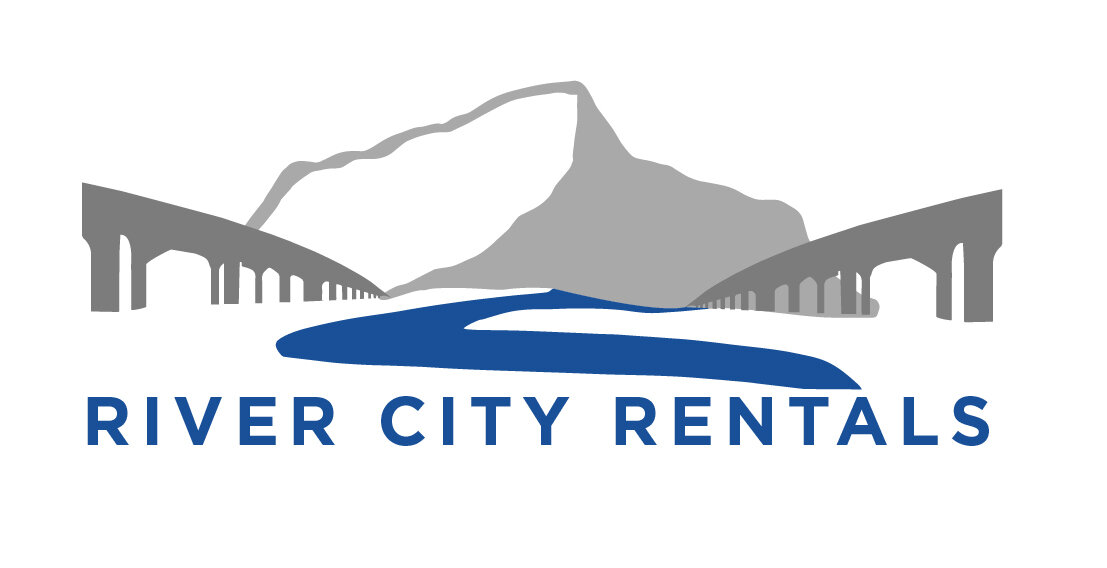
Primary Logo
Secondary Logo Styles
Font
Swatches
Merch
Welcome Postcards Concepts


The Chosen One
The final postcard layout below, we wanted our guests to know that they are in the best care and hands possible.
Business Cards


